Carrier Loadboard: Loadsmart Loadboard's Redesign

Replacing a Phone Call with a Better Experience

Project timeline

Overview

Loadsmart's load board connected carriers with freight, but most bookings still happened over the phone. Carriers preferred calling their sales reps because the app lacked key information and the personal touch they were used to. The challenge was to create a digital experience that felt as helpful and reliable as a good sales rep without losing what made those relationships work.

Goals

  1. Reduce dependency on phone calls for routine bookings
  2. Design a mobile experience that works for drivers away from their computers
  3. Enable negotiation inside the app to replace back and forth calls
  4. Surface the right loads based on carrier preferences
  5. Increase conversion and visits to the load board
Role
Squad Designer / Lead Designer (Later)
Responsibilities
Squad designer from 2019. I owned the entire UX process: user research, journey mapping, competitive analysis, interaction design, prototyping, and validation.
Collaborators
Stakeholders, Customer Support, Customer Success, and Engineering.
Timeline
Nov 19 - Jun 20
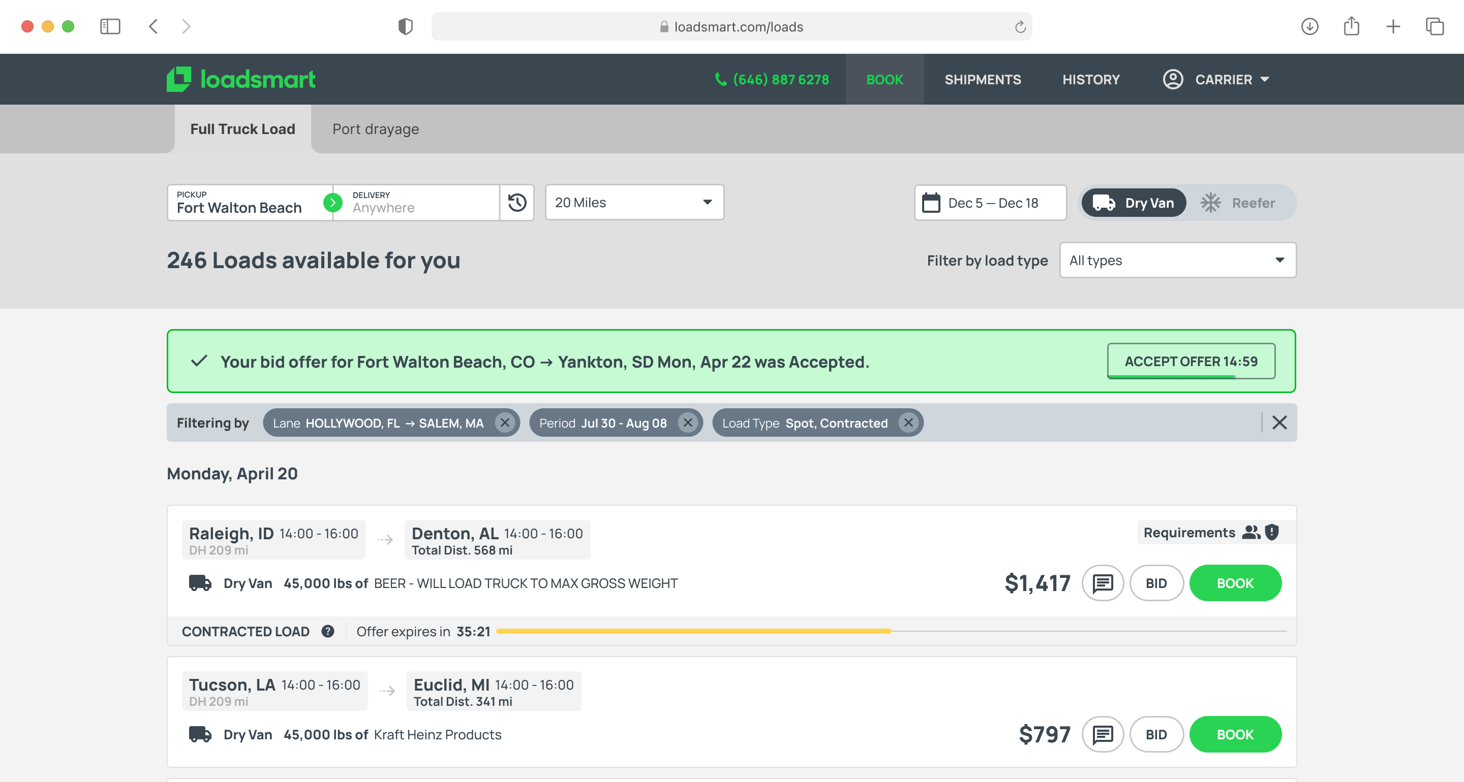
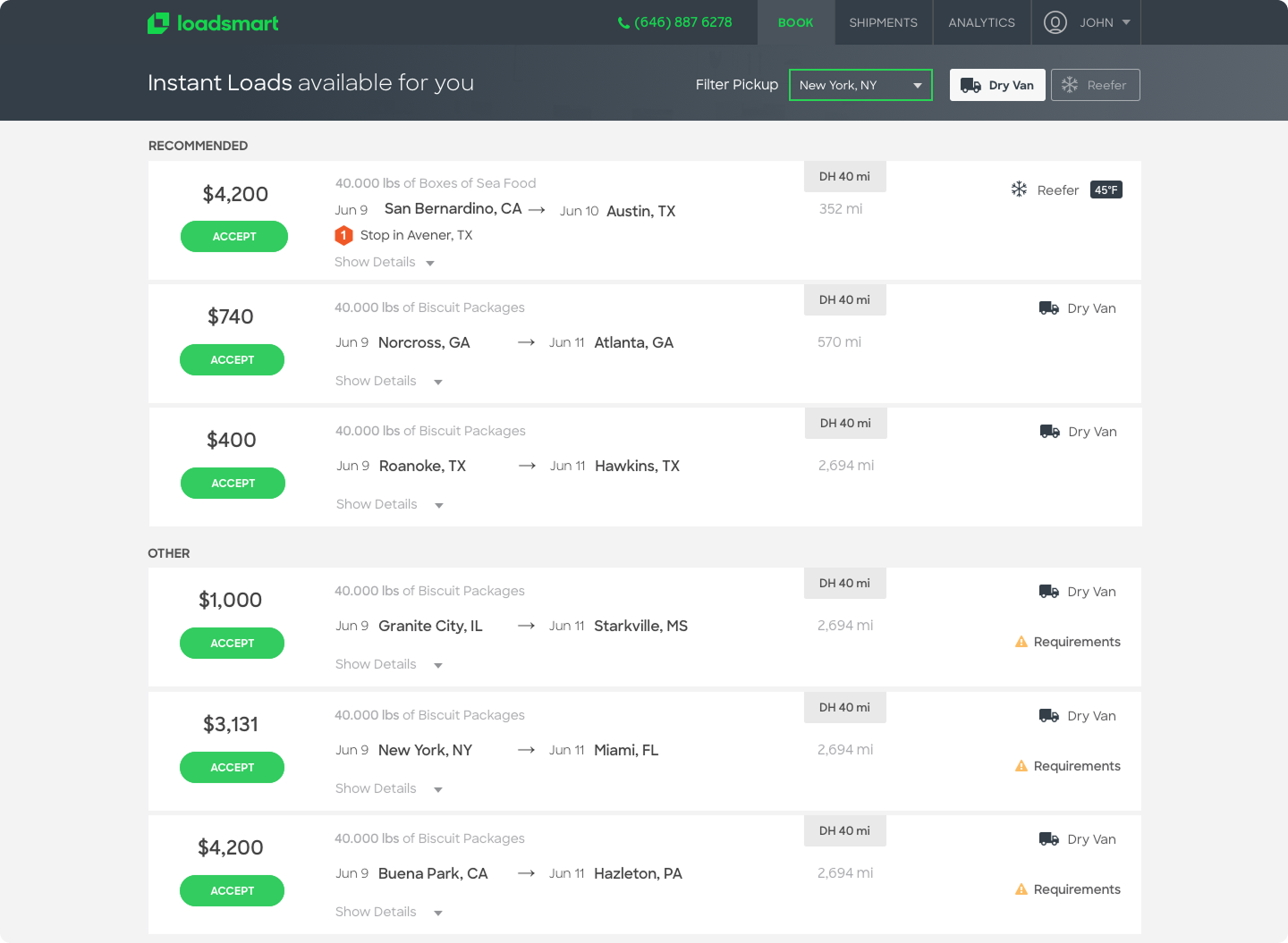
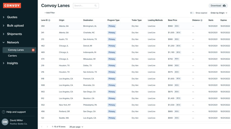
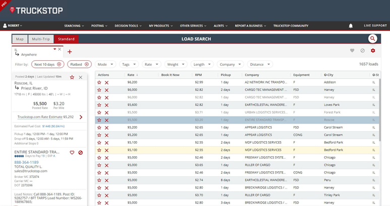
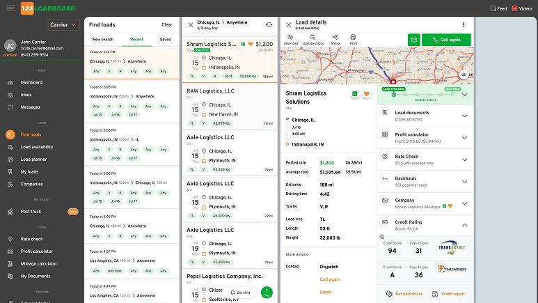
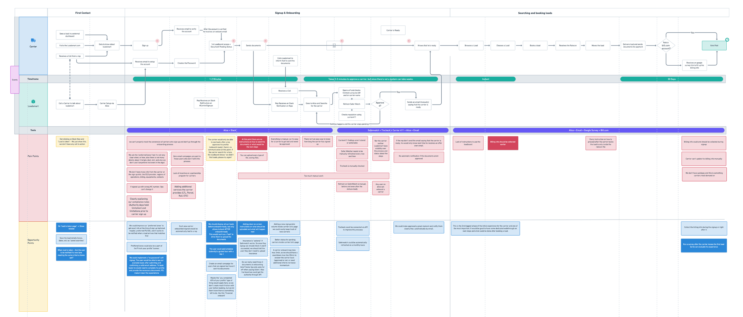
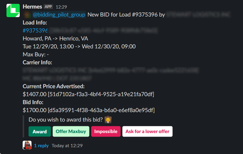
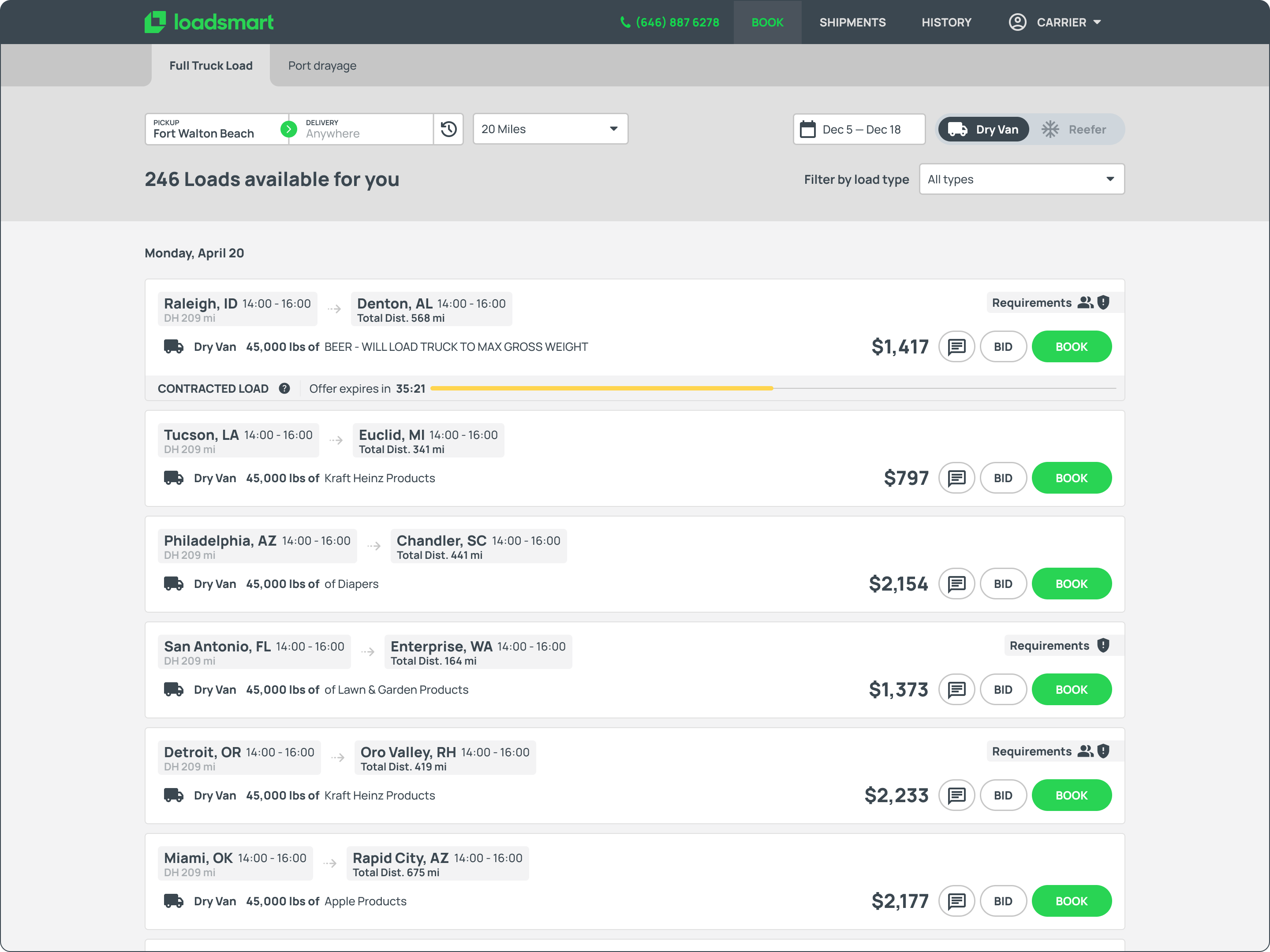
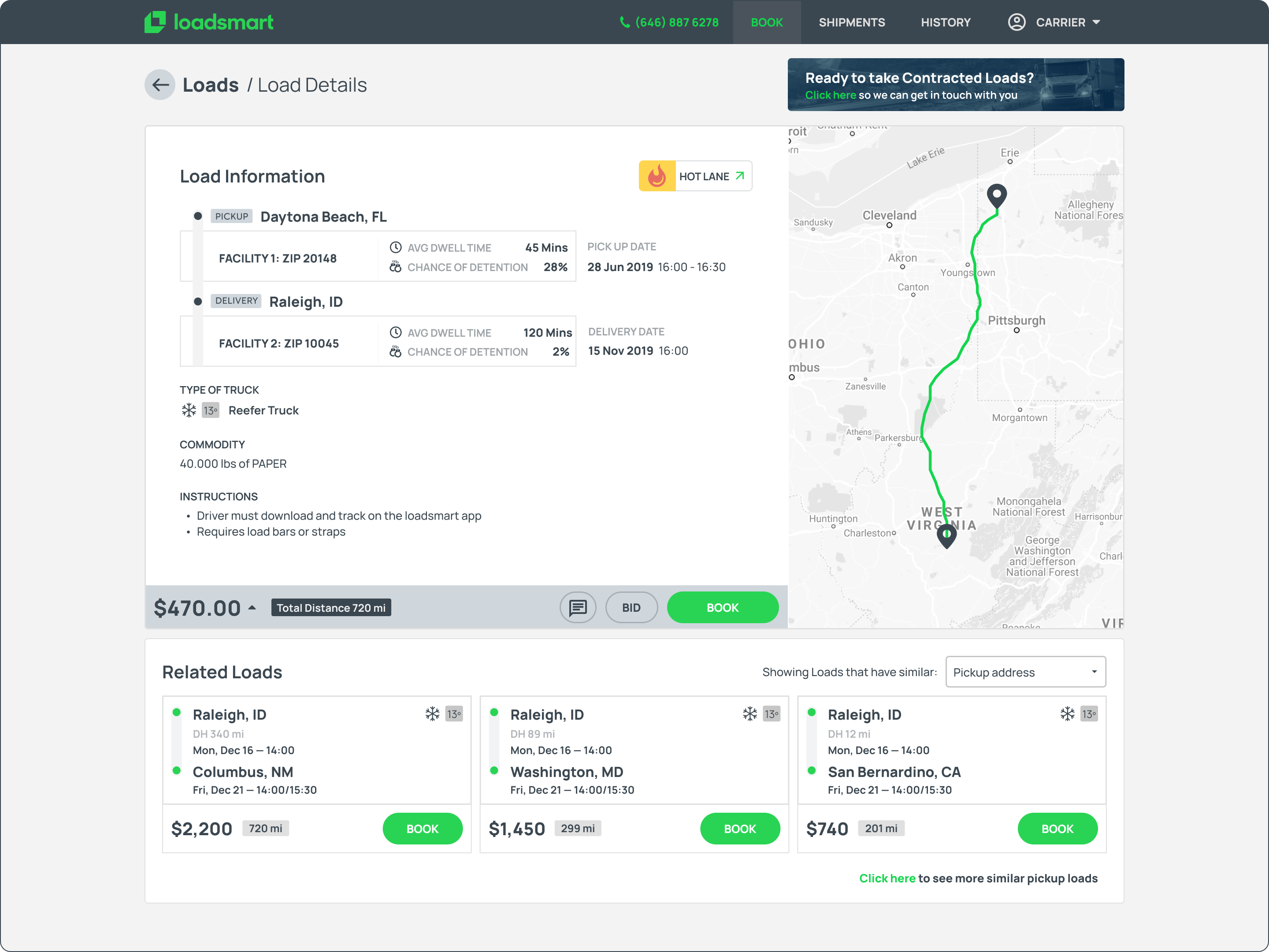
Our loadboard was a very feature-dry application. Carriers could log in, view and filter a list of loads, and accept one. Nothing more. While it served its basic purpose, it lacked the depth needed to drive engagement and traction. Carriers would often visit the loadboard, eye some loads, and then call a sales rep to negotiate the load or maybe be offered another one.
USER Need
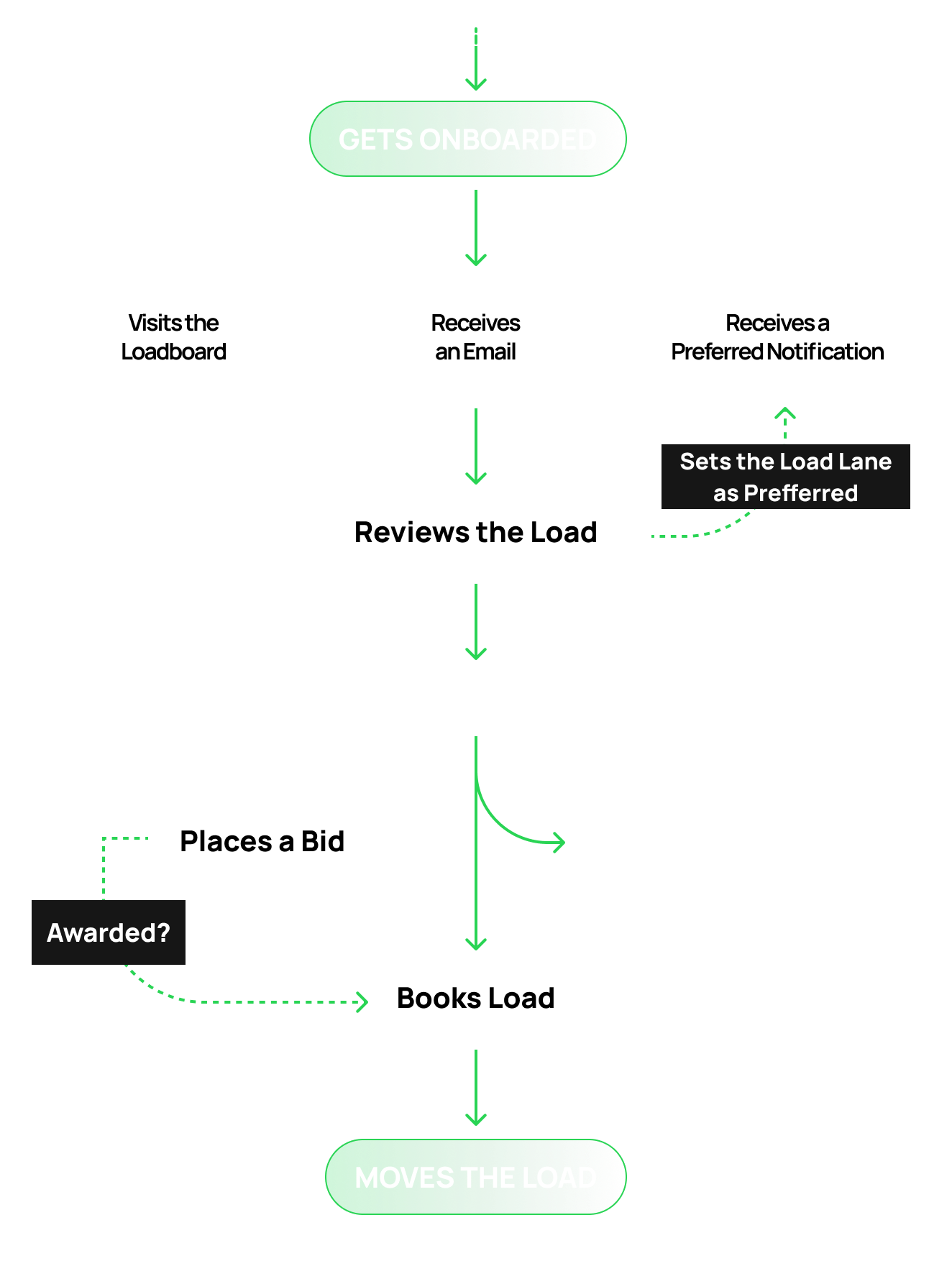
Carriers need a self-service experience that gives them the confidence and capability to evaluate and book loads without relying on sales reps.
Business Need
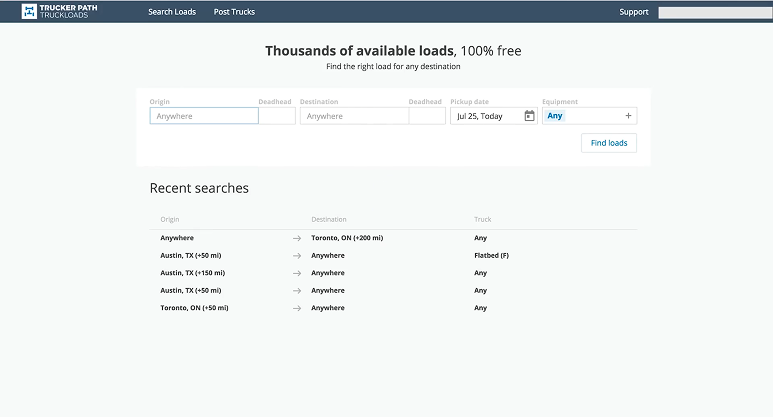
In order to scale digitally, the company needed carriers to browse and book loads entirely through the loadboard.
problem to solve

Carriers were not booking loads through the loadboard because the experience was too shallow. Without detailed information or negotiation tools, carriers would browse and then call a sales rep to finalize. This dependency on human intervention undermined the company's ability to scale digitally.

RESEARCH

Competitive analysis

I reviewed several platforms to identify best practices for Load browsing, booking, onboarding and mobile experience, focusing on 100% online experiences, load details information grouping and easy of use.
1 LOAD DETAILS
What essential details should shippers provide to make booking a question-free experience?
2 DIGITAL
How can we reduce offline interactions without undermining our existing sales representatives team?
3 EASY OF USE
What design approach maximizes user pattern recognition and conversion?
4 MOBILE EXPERIENCE
What features should be on the mobile version and which ones aren't 100% crucial?

Recurring Themes

LOAD DETAILS
Leading platforms like DAT and C.H. Robinson display upfront pricing, pickup/delivery windows, equipment type, mileage, and broker credit scores. Instant booking requires complete load information—carriers won't commit without knowing detention policies and facility ratings.
MOBILE EXPERIENCE
Top-rated apps (Uber Freight, DAT One, Navisphere) prioritize one-tap booking, GPS-enabled tracking, and document upload via camera. Non-essential features like detailed analytics can remain desktop-only. Push notifications for matching loads drive higher engagement and faster bookings.
DIGITAL EXPERIENCE
Uber Freight and Convoy prove 24/7 automated booking eliminates phone tag without replacing sales teams. Transparent pricing removes negotiation friction—carriers see rates upfront and book instantly. Smart filtering and saved lane preferences help surface relevant freight automatically.

Addressing the user pain points

The research uncovered four focus areas: transparency in load details, digital workflows that complement sales reps, simpler paths to booking, and a mobile experience designed for the road.
1 LOAD DETAILS
Location, timing, equipment, weight, and rate. Include payment reliability indicators and facility information.
2 DIGITAL
Automate routine transactions and status updates. Keep reps focused on complex deals, relationships, and problem-solving.
3 EASY OF USE
Simple search, saved preferences, clear pricing, and minimal steps to conversion.
4 MOBILE EXPERIENCE
Search, booking, notifications, document capture, tracking.
How might we

How might we make booking loads faster online without losing the personal touch of our sales team?

USER JOURNEY

Mapping the Journey

Guided by research insights from user interviews and shadowing sessions, I iterated on design directions to address the fragmentation investors faced across multiple platforms. Principles like workflow consolidation, data integrity, and operational efficiency informed every aspect of the CRM solution.
Personal Bonds First
Carriers build relationships with sales reps from day one. Their first platform experience is through onboarding, making the rep their main point of contact
Small Asks, Big Value
Carriers often negotiate small rate changes, but the real win is what reps offer in return: connecting loads or return hauls that make the trip worthwhile.
Thick as Thieves
Sales reps learn carrier preferences over time. They proactively offer loads on preferred lanes, sometimes before the carrier even searches.
App Left Behind
Carriers skip the app entirely. Limited features and less load information than a phone call make it easier to just call their rep.
IDEATION

Developing Concepts

Using insights from the competitive analysis and journey mapping sessions, I defined three core themes to guide the design. These principles shaped a new carrier experience that brings the best of our sales team into a fully digital platform.

The New Carrier Journey

The App as Your Rep
It feel like a dedicated sales rep in your pocket. It learns your preferences, suggests relevant loads, and guides you through every step—without needing a phone call.
Mobile First, Always
Carriers are on the road, not at a desk. Every feature must work seamlessly on mobile, from searching, to uploading documents to tracking payments.
  1. Onboarding: User-friendly, 100% digital sign-up. No paperwork, no waiting.
  2. Preferred Lanes: Carriers set preferred lanes and get notified when matching loads appear.
  3. Booking: See a load, book instantly—or place a bid and get a quick response.
  4. Tracking: Real-time notifications keep carriers updated on every booking status.
These ideas shaped the designs we tested next. The goal: make the app as helpful as a good sales rep.
USER TESTING

Testing the Ideas

Before moving to development, we needed to validate the concepts with real users. This meant finding creative ways to reach carriers and test complex features without heavy engineering investment.

Reaching Drivers on the Road

Carriers were the hardest users to reach—they're literally always driving. Testing prototypes only with dispatchers would give us false positives since they're not the ones on the road making quick booking decisions.

I tried everything: cold calls that went to voicemail, Hotjar surveys with low response rates, even Amazon gift card incentives. Nothing worked well enough.

What finally got results: joining live sales calls and borrowing 10-15 minutes at the end for quick unmoderated tests. I also ran remote sessions through Lookback with carriers who had downtime between hauls. It wasn't scalable, but it gave us real feedback from real drivers.

Faking It Before Building It

The bidding feature was central to the new experience, but building a full pricing algorithm was a major engineering effort. We didn't want to invest months of development on an unproven concept.

So we faked it. Carriers could place bids through the app like normal, but instead of running through an algorithm, a Slack bot pinged a sales rep who manually approved or rejected each bid behind the scenes. Carriers got a real experience; we got real data.

The result: conversion increased and carriers engaged with the feature. That was enough validation to move forward with the full solution.
FINAL DESIGN

Loadboard 2.0

After multiple rounds of testing and refinement, these are the interfaces that were created. Each screen represents either a complete workflow or part of a larger feature, designed to handle complexity without creating friction.
Property page
Redesigned load board page with adjusted information structure, different load types, upfront requirements and bidding option.
DEAL VIEW
Load Details page with related loads (connecting or returning hauls) detailed load information and route, price breakdown + DAT Comparisson tool.
Inbox
Preferred Lanes Management Page. User could add/remove/edit their preferred lanes and its notification rate.
Onboarding modal
Document Uploading Onboarding step.
Booking modal
Completed Booking step, with options to set that lane as preferred and related loads.
Load offer email
One of our major turning points was redesigning the emails, measure its peformance and iterating around those metrics.

Mobile Experience

The mobile app extends the platform's capabilities beyond the desktop, giving carriers the flexibility to manage their business from anywhere. Designed for drivers constantly on the move, the app leverages native smartphone features to deliver a more contextual and responsive experience.

Intentional Interactions

The mobile experience takes advantage of built-in smartphone features to provide carriers with more relevant and timely information. GPS localization surfaces available loads near the driver's current position, reducing empty miles and helping them find freight quickly.

Push notifications deliver real-time alerts for new loads on preferred lanes, bid status updates, and booking confirmations, keeping carriers informed without requiring them to constantly check the app.

Native App Performance

The mobile interface wasn't a direct translation of the desktop version. Heavy data tables and complex workflows were adapted rather than shrunk, presenting only the information investors needed while on the go.

This approach prevented overwhelming mobile users with desktop complexity that didn't translate well to smaller screens.

Some features, like drive-for-dollars, resulted in exclusive native mobile apps designed specifically for field use.
Mobile Experience in Action
A walkthrough of the native app showing how carriers can search for loads,
place bids, and track their bookings on the go.
IMPACT

The Results

Each feature added stability to the business. The mail template tool reduced dependency on external services, keeping users inside the platform longer. SiftLine's automated lead capture turned marketing efforts into organized pipelines without manual work. Automation flows eliminated repetitive tasks that previously drove users to competitors.

In July 2025, REISift was acquired. The acquisition validated not just the feature set, but the approach: building iteratively with users, measuring constantly, and growing without external pressure to scale prematurely.
12K
Monthly views
16%
CONVERSION RATE
64%
APP USERS INCR.
2.5x
CARRIER REVENUE

What I learned from this project

Every project teaches something new. This one pushed me to rethink how I approach research, stakeholders, and validation. Here are the key takeaways I carried into future work.
Talk to the People Around Your Users
When your main users are hard to reach, look for the people closest to them. Sales reps knew carrier habits, frustrations, and preferences better than anyone. Dispatchers could speak to daily workflows even if they weren't behind the wheel. These proxies filled the gaps when direct access wasn't possible.
Measure with Purpose
Tracking everything sounds smart until you're buried in meaningless data. I learned to define what success looks like before testing, not after. Clear metrics made it easier to iterate quickly and connect user feedback to real outcomes.
Test the Concept, Not the Code
The fake bidding tool proved we didn't need a finished product to validate an idea. A simple workaround gave us real user behavior and real data. Building just enough to learn saved months of development on features that might not work.
Design for Trust, Not Just Tasks
Carriers didn't just want a faster app. They wanted something they could rely on the way they relied on their sales rep. Features only mattered if they felt dependable. Trust had to be designed in from the start, not added later.